Character comes first
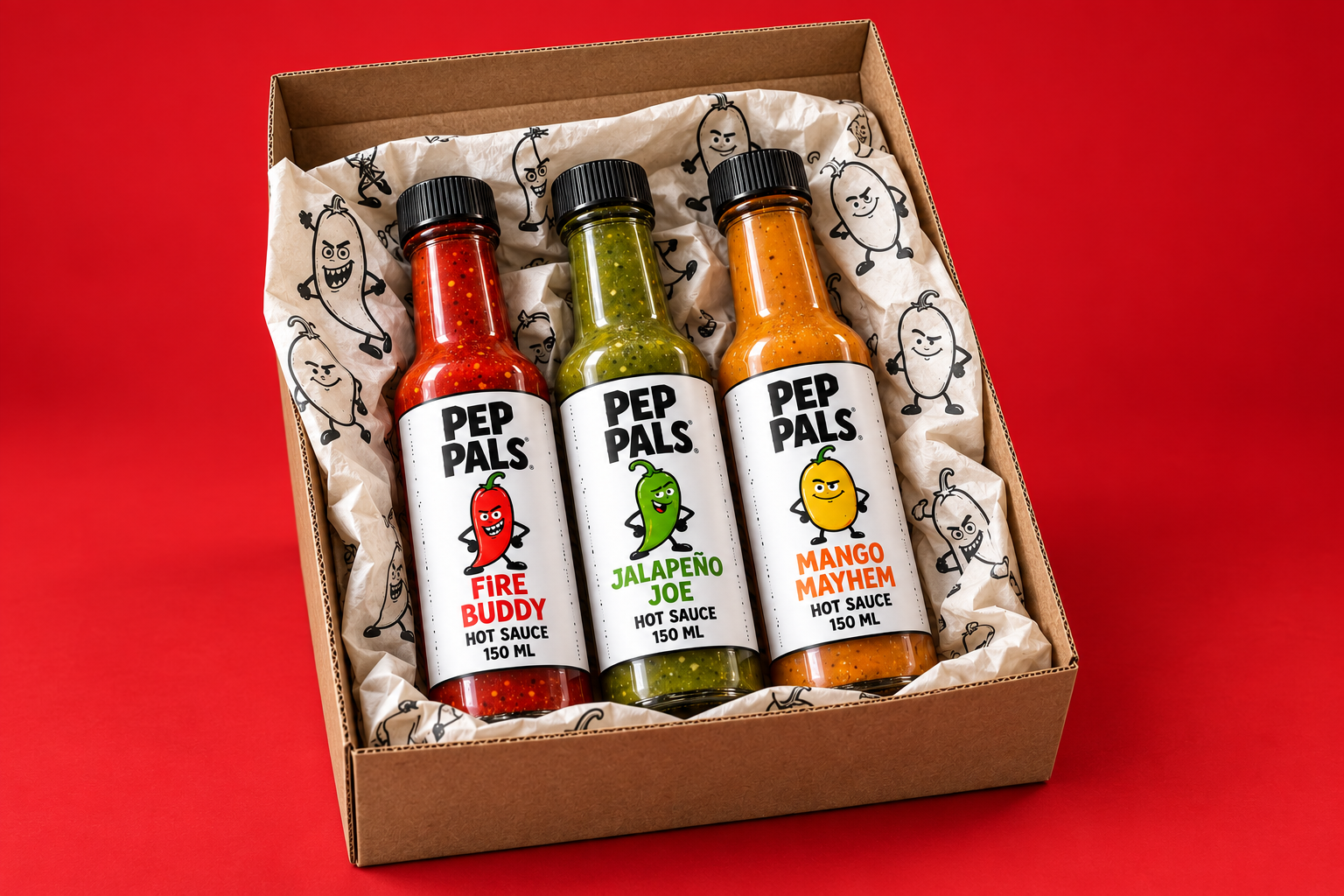
Illustrated personalities and bold type make the three sauces recognisable, memorable and easy to tell apart.
WEBSITES + DIGITAL IDENTITY
A little flavour. A lot of personality.
Visit live site ↗The project
We brought Pep Pals to life through its brand identity and website. Three sauces become three distinct personalities, connected by playful lettering, punchy colour and character-led packaging. The website carries that same energy into flavour exploration, product interactions and recipe discovery.
Illustrated personalities and bold type make the three sauces recognisable, memorable and easy to tell apart.
Flavour notes, heat levels and food pairings sit beside the products, with quantity and bag controls close at hand.
Recipes extend the experience beyond the product, showing how the sauces fit into everyday meals.
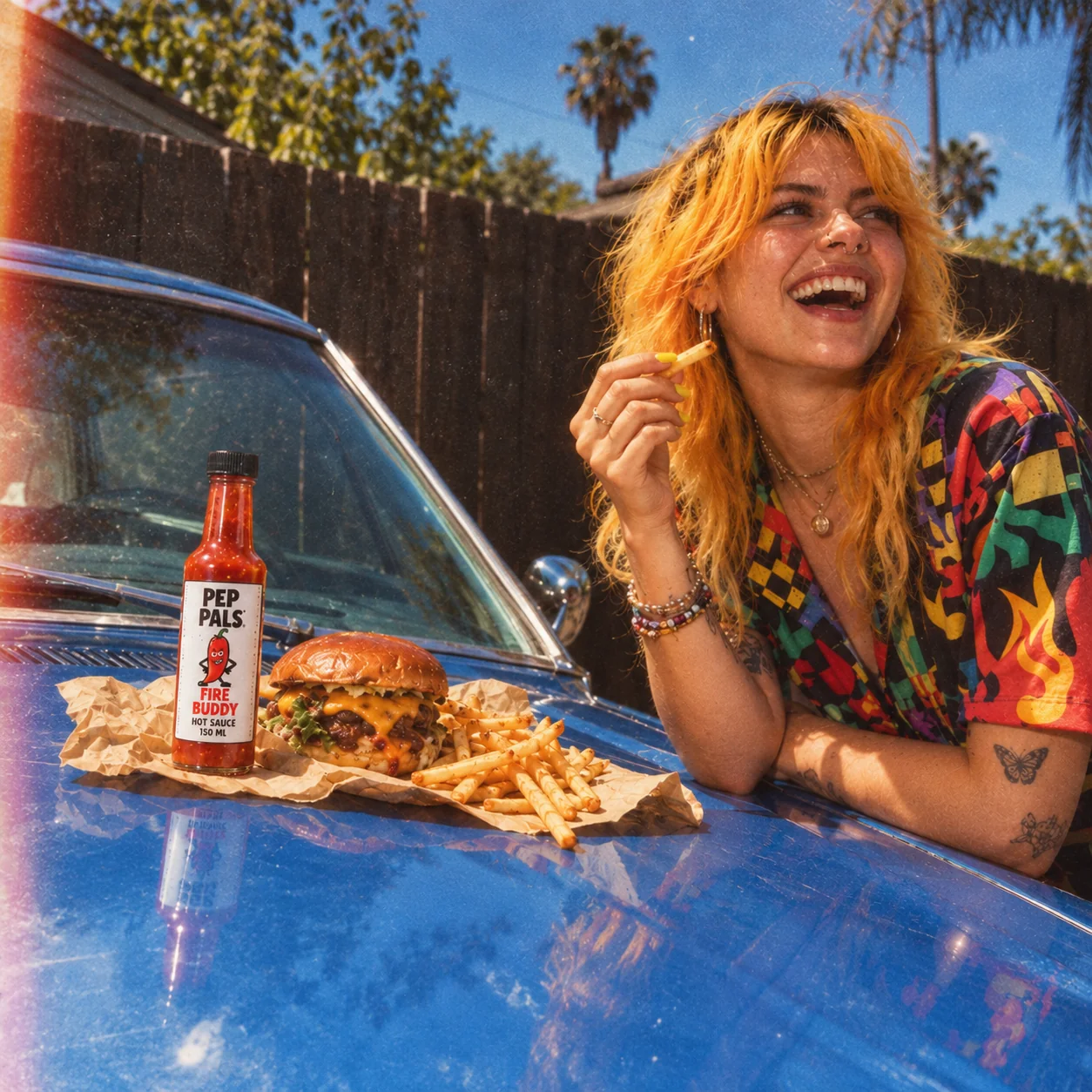
The brand, out in the world.
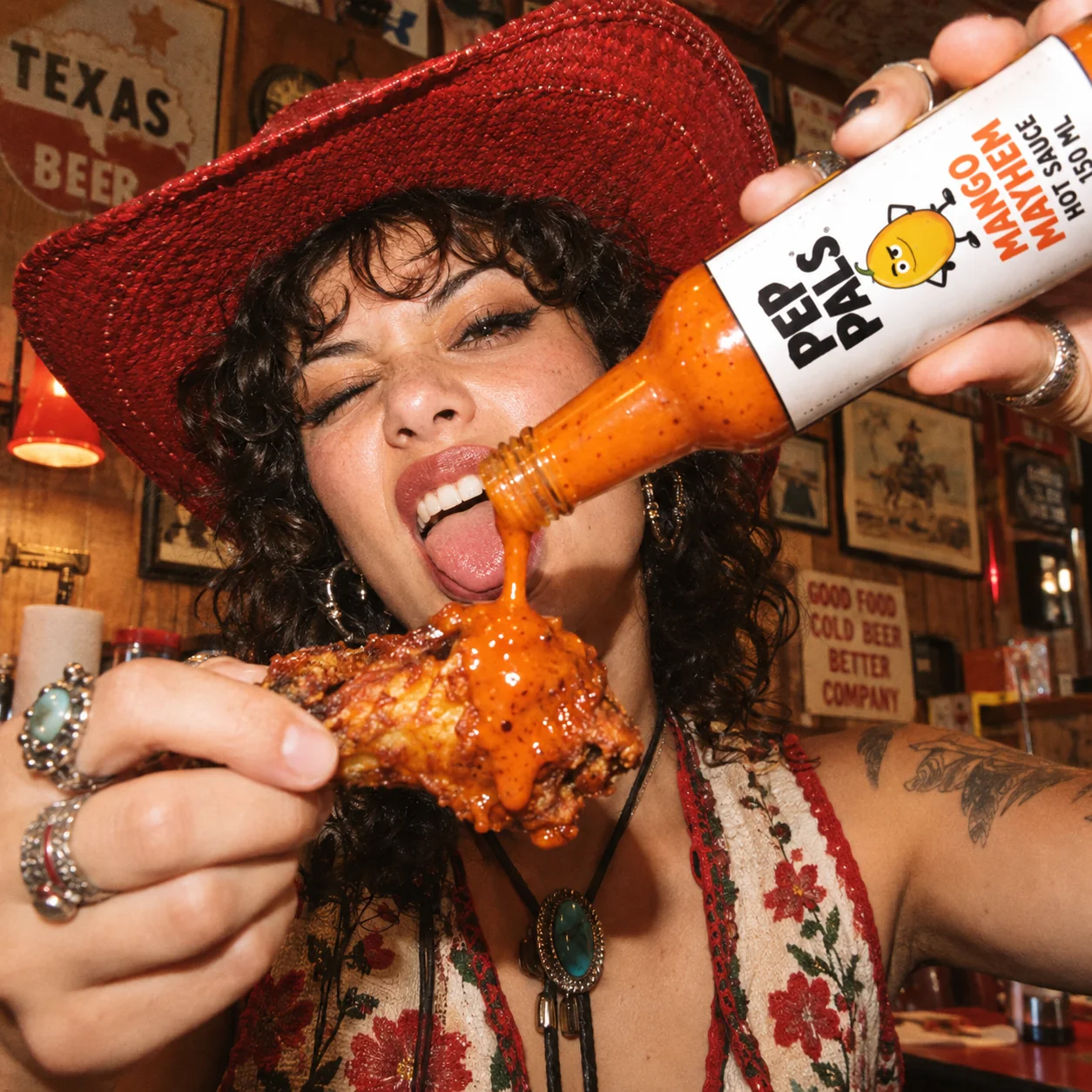
Photo 1 of 3: Mango Mayhem, in good company.
Visual language
Orange, cream and dark ink give the illustrations a strong stage. Colour and character help organise the product world.